Thursday, December 9, 2010
Drawing in Sketchbook
My favorite drawing of the semester, even tho i haven't finished it. I used a bottle of ink and a feather
Monday, December 6, 2010
4th Year Critique Vance-Chavis Library
4th year critique December 6, 2010
The project addresses a problem due to community growth, and technology advancement with an effort to engage the community by reconstructing and redesigning the vance-chavis library. The students worked together during the semester collecting data and doing research on better ways to improve the current library. In their discussion, I was inspired by how well they communicate their ideas and the excitement the showed concerning the project. They spoke about their ideas in great detail showing the amount of research and time they put in. Their effort showed a great deal in their work because the plans concerning space issues, age differences, and changes with more technology were addressed thoroughly. They talked to the people in the community who would be using the library to find out what it was they were looking for in the library and what would be most beneficial to them. They used this information to find sustainable ways of creating these designs by incorporating grey water systems and designing the spaces so that they would be most useful. They designed the children's area in a way that would best fit the needs of the children and their parents. The adult section was located right next to the children's so their parents were able to watch them. Ceiling heights were also accommodated to fit the children's preferences.
An extremely important part of their process to me was the data that they took concerning light angles at different times of the day and documented computer use. The data showed them exactly where fixtures or windows would be most useful and they considered trees for shading part of the sun. This work is very important to a design because it will change how community members are able to use the area. Incorporating so much detail and thought into these designs makes them most useful to the community which also allows the building to be economical which is important.
My favorite part of the presentation was their interest in what they were designing. They showed to have great inspiration and care for the designs and wanted to improve them. I think this shows that they have well explored the area and done large amounts of research to improve their ideas and put a lot of work into them. I really like the thought that went into the design. If someone did not think of one thing, another group member would add and with the questions that were asked during the presentation, It was easy to see that they had encountered many problems and worked through many different solutions in their process to come up with their best solution.
Friday, November 12, 2010
Light
This idea was to stack three sets of paper to show a glow of light get weaker towards the top similar to the weakened dull light coming through a window. I thought the concentration of light towards where the bulb was was too bright, so i went back to my original idea and decided to work with sheet plastic.
This one i decided to use the sheet plastic without any paper at all. I really like the effect the sanded sides have because they reflect light in a cool way but it does not get the point of my light phenomenon across, which is the light changing from sharper to dull and becoming dim, overall change.
This was what i came up with by using the paper and the plastic together. I like this one because it shows the different values of the light and dark and also shows a brighter light. I left the bottom open because the warmer light can be seen there and it changes to a cool color when its through the paper. I sanded the sides of the plastic to dim the light and it has a cool effect that is hard to see in this one picture.
This is what it looks like in the dark so you can see the lines of sanded plastic and the different light and darker shades of the lighting through the paper. Also, you can see on the bottom the warm color from the light reflecting from the stain and the pink/purple color that it makes on the wall from transferring through the blue paper. I made this by using super glue on the plastic, which fell apart when it fell on the floor, so i am going to remake this using bolts in the plastic and use a thicker plexi glass. The middle is blue vellum paper and for the base, i drilled a hole down into the block of wood with the drill press, then out the side for a place for the cord to go. I screwed the light into the base. The corners of the base are used with pieces i cut to go around the actual base so that all the edges would look the same. The brown color was from the stain i made with oil paints and thinner. I think this version best shows my idea of the light changing through the paper and through the plastic because also, on the other side in the next picture, you will see how the light there appears purple.
This is my favorite view of the lamp, because it is the exact same lamp as the picture above but it shows a completely different light and has a completely different feel to it. The color is even completely different from very blue to a light purple whiter looking light. I think this really shows what i mean to through the transition of color and the layers in the paper with different angles.
Wednesday, November 3, 2010
Sketchbook Drawings
Drawings From my Sketchbook
I did this drawing mostly with 8B and some pencil. It started out to be a self portrait but I got bored with drawing myself literally and changed it to show a way of how I may see myself or how I could see other things instead of focusing on what i look like.
Leaf From Brazil. I used pencil shading to make dark and light values and left whites to show highlights. The dark is not as dark as I would like it because there are supposed to be holes in the leaf but it is hard to tell without the darker shading where the leaf ends and gradually making it lighter over the top of the leaf to give it more dimension so it will look less like a flat picture. Adding more detail and distributing the darks and lights more carefully will help this look more like the leaf.
"Nun with Gun"
This is a contour line drawing i did of myself as a shadow while drawing this. I was standing by a window and the light made my reflection onto a wall so I drew the reflection of myself drawing and I traced it from the back page of the one i drew the original on. It looks like a nun with a gun.
Drawings from Jack Kennedy's and Holly Burda's Sketchbooks
This gesture study was done by Jack Kennedy. It shows both extremes of dark and light shading. The way the bark and lines in the branch were represented in a more abstract way allows us to see the feeling and harshness of the bark instead of only looking at as the branch itself. We see the contrast and harshness and direction of the lines or values without being distracted by the fact that it is a branch.
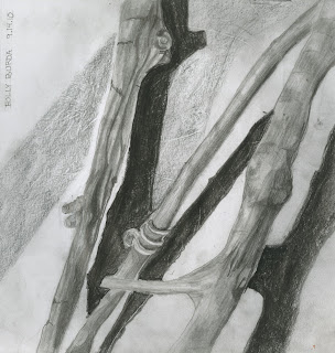
This is a drawing by Holly Burda. It shows the shadows of the twigs and also light. The changes between dark and lighter shades of gray in the shading create more dimension through contrast.
Tuesday, October 26, 2010
Light Artist Marcus Tremonto
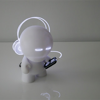
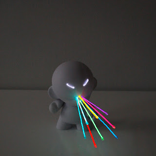
Marcus Tremonto's light art in these two photographs were inspired by video games. His compositions show images that are full of light instead of showing a direct light source. Instead of solar light, he uses cool burning electroluminescent wires.


http://www.designboom.com/weblog/cat/8/view/9074/marcus-tremonto.html
http://www.lightmark.de/lightmark_54.htm
cenci goepel and jens warnecke's art is more imaginitive and showing light in unreal places, while Marcus shows light in a more realistic but animated way through video games and electronic themes.
Thursday, September 23, 2010
Leaf Sketchbook
Sep 01. In Studio. The leaf appears old, dried, and tired. I showed this through the drawing by using many unblended lines to show the cracks throughout the leaf and also the thin dried veins. By not completely blending all the values, I made the leaf appear more fragile and stiff.
Thursday, September 9, 2010
Studio Project 1
I first started my projecct with a same length paper covering the whole leaf. In my fnal one i changed the paper to be half of the tail and one of the top. It is a lot thicker in the middle to dramatacize the shape and width of the leave as it gets smaller towards the ends. My idea for this leaf was a strong leaf that could survive in harsh conditions becuase of its sticky sharp texture. That way, most of the leaf should be exposed to the sun and the way the paper is folded contrasts with the shape of the leaf making such a small leaf more visible and defined.
Subscribe to:
Posts (Atom)


