Wednesday, September 7, 2011

[211] name plate designs


this is the name plate that i designed for tricia. I integrated geometric shapes and composed it entirely in black and white to achieve the highest level of contrast. 


tricia designed this name plate to represent me which i think fits me well as a designer. it has planes of many different lengths but they are balanced in their placement and the color scheme used flows well.

[211] entrepreneur poster

Tuesday, September 6, 2011

[201] industries of the blind diagram


This diagram represents the experience that I had entering the Industries of the Blind and moving through the building. The first thing i notices entering the building was the materials used. Outside is constructed of brick and the inside has white walls and tan floors. The space is very bland in color and the materials represent a strict environment representing the separation of upper management from regular employees in the past. I also experienced the high ceilings in the first area through the front doors with the tall stairs that are steep going up to the next floor. The spaces and hallways are very narrow and very tall. The space feels very structured. Then, I noticed the way the downstairs working areas were set up. The areas are set up with many working spaces in one open area for all of the workers to communicate while doing their work. This is much different from the feel of the rest of the building because this space feels more open and there is more communication throughout the space.

[201] industries of the blind narrative and sketches

Thumbnail Sketches


Industries of the Blind is an organization that provides military equipment for the government. The majority of the employees working there are blind. It changed from a company that has separation of Senior management from other Employees to now being and open high trust organization. They focus on culture and promote openness and trust.  Entering into the front of the space was very narrow and there was a green garden center in the back left corner of the entranceway. There was a sense of height to the space because the walls were narrow the the ceiling was high and elongated. The staircase on the left was also narrow and tall. The stairs and building on the inside had an institutional feel with white falls and closed off windows. We met in a room with the David LoPresti, the head of the organization, who told us about how work there has changed since he has become apart of the organization and the history of them. The building closed off from the outside because at the time they did not want their workers becoming distracted by things that were happening outside, and they also did not want outside people coming in and seeing what they were doing. There was little trust within the company and there strict supervision to make sure that employees were always doing their job with strict policies. Today the Industries of the Blind is very welcoming to its workers and promotes relationships between workers within the organization. The people who work in this organization enjoy coming to work everyday and doing their part because they know that the work they do is important so they want to improve and do a good job at what they do. There is a great sense of trust and commitment to work since the organization has become much more open. The employees are people who want to do a good job at work and enjoy coming to work because of the open environment and trust. LoPresti knows all of his employees by name and knows things about them. They enjoy talking to him and working for him and they know that their work saves lives. The space today is very strict and sectioned off. Walking through the space, it was not built for promoting communication. Downstairs where employees are working on shirts for the military that absorb moisture, and a guard to stop bullets from going into the back of a person's neck, they have very large open spaces. They have made it an open environment for communication because there are tables for working but now walls. LoPresti mentioned that he wanted to change the front entrance to make people want to come into the building and see how the organization runs. Right now the entrance is very plane and small and it does not make you feel like you can come inside. They want to promote communication and an open environment and invite people from the outside in.

[211] 2 pt. perspective vanilla candle

Friday, September 2, 2011

[201] Experience Diagram: Greensboro Historical Museum


This diagram represents the overall feel that I first experienced when I entered the space. The overwhelming color covering all of the walls that are seen from all floors at the same time from the entrance. The stairs spiral upwards and are not continuous so it is a very hectic feeling. What stood out to me the most was the green and red color along with the many curves in the walls and stairs.

[201] GHM Narrative

For our first visit to the Greensboro Historical Museum, we began out in the parking lot across the street to observe the building entering from the parking lot, like most people who visit the museum will experience it. From across the parking lot I noticed the brick material to the outside and that there was more than one entrance to the museum. The sidewalk parallel to the building was broken up and we had to step over cones and caution tape to get to the front entrance that was a large space in front of the building where the walls came at a curve on each side partly enclosing and outlining the large sidewalk with the tall flat curved front as space. When I first walked into the museum the first thing I noticed was the overpowering green covering the walls everywhere all the way from the first floor up to the top. The entire space was open and the same color green was covering the walls all the way up to the top in the main area and on each level of the floors to the right and also covering the stairs that spiral up, and then there is a break, and then they spiral up again. I also noticed the red that was on the stair railing mixing with the green that was everywhere. The floor underneath the second set of stairs was white and stood out from the rest of the area. The gray tile floor and gray and black dotted stone framing the door did not tie in with the green vinyl walls or the red railings. At the second floor level I could see the whole entrance, the whole fist floor and the whole third floor. The same experience was encountered on every floor. The museum colors and arrangement of floors were overwhelming. All noise and colors and objects throughout every main space on the three floors are all experienced at one time, instead of gradually being led into the space. Everything is experienced at once and the design of colors, materials, and furniture do not go together. It is a very overpowering mixture of many different things all at one moment.

[201] WAM Diagram: Light and Experience


The Gradation around the sketches represents the light becoming dimmer as you go into more confined spaces into the museum. I concentrated the shadows in the drawings  more as you go further into the space to represent that the focus increases the further you go into the space. It begins as a light glow lighting the whole area to the lights being directly focused on the path, and then onto the works of art.

The Weatherspoon Art Museum seems to strongly rely on the lighting of the space. I went back to the museum during the evening to see how light would be experienced differently without the bright light coming in from the ceiling in the main circulation space and also the windows. The light first entering through the garden slightly lights up the whole overall area. Then, as you move inside the main circulation area the lighting creates a glow that is evenly distributed softly lighting the whole area. Towards the stairs the light became more focused lighting the way of the path.  light spreads across the stairs, encouraging visitors to go see what is past them. Then on the second floor the lights on the ceiling highlight the works on up on the wall. As you go into the rooms displaying works of art on the wall, the light becomes most focused here highlighting directly around the focus points; the art that is displayed.

Thursday, September 1, 2011

[201] WAM Narrative

When entering the Weatherspoon Art Museum from the back I tried to experience the building from the perspective of someone who had never been there before. At the entrance I first saw the large iron gates that brought me toward the opening. From way back in the parking lot I could not see an entrance into the building; the only thing i saw was the outside garden, the brick wall to the building, and the high narrow window going all the way to the top of the building, but the openness of the iron gates and the brick walls on each side led me into the garden area. In this area there were trees and a few pieces of art. Over to the left is where I saw doors going into the building. I had to cross paths in between columns to enter on the path that leads into the doors. After going through the first doors I went into the second set of doors and I was then standing in the main circulation of the museum. The first thing I noticed was the large amount of light coming in from the open oval shape in the ceiling that opened up to the sky and how if blinded the walls and floor with light. I walked over to the hallway towards the right and at the end was a huge rectangle window covering the entire end of the hallway that brought in blinding light. Then, I noticed the stairs on the other side of the main entrance that were half-way behind one column. At the top of the first set of these stairs was another bright blinding light coming in from tall rectangular windows that curved along the side of the curved wall to the building. At the top of the second set of stairs was a small wooden door with a small circular window in the top. I went through this door and on the second floor was another hallway leading to light pouring in from a window at the end of the hallway and to the left was a large circular window that looked out across the street. The columns from the front entrance to the building were directly in front of the window blocking a lot of the view.  As I went down the hall to see inside the rooms where they display the art exhibits, I saw that the light was a lot dimmer inside of these rooms. There was only the glow of the lights shining around the pictures on the wall to light the space drawing attention to the art.

Wednesday, August 31, 2011

[211] Perspective Design Concept

Concept: Vanilla Candle

Vanilla - (Originated in Mexico, Used in many different ways by many different people) - Vanilla originated with the Totonaco Indians in Mexico and the vanilla beans were reintroduced by Hernando Cortez. Vanilla was then mixed with cacoa to make a drink. In 1602, it was then discovered Hugh Morgan that Vanilla should also be used as flavoring and is now used to enhance foods and drinks; it is even added as a scent for perfumes, air fresheners, and candles. Vanilla is one of the most widely used flavors in the world and is mostly grown in Madagascar, Comoro, Seychelle, and Reunion. Although vanilla originated in Mexico, most of it today is produced in Indonesia and Madagascar.

Candle - (Originated from many different places, same concept, all created in different ways to bring visitors and guide their way) - Ancient Egyptians and Romans were known to have made the first wicked candle by dipping papyrus in beeswax, although it is most likely that many civilizations used candles, they all had a different way of making them. In Japan the wax used to make a candle came from the wax of tree nuts while in India fruit from a cinnamon tree was boiled to get the wax. In ancient times they were used to provide light for visitors or in religious ceremonies. 

Nielsen-Massey Vanillas Inc., Nielsen-Massey Vanillas International, LLC
http://www.candles.org/about_history.html

Principles 

Proportion: The candle is much larger than the flame. The light scent, calm neutral color, and small flame  are proportioned to each other.

Balance: light scent of vanilla filling the air balances with the warm feeling from the light

Unity: vanilla candles are brought together by the use of so many cultures originating around the same 
times. Cultures are brought together through the use of the candle for rituals and use of vanilla for flavor and scent throughout history

Emphasis: Emphasis is on the light; light from the candle guides people towards it, provides light, and warmth; it is welcoming. 

Rhythm: flame flickers in the wind, the actual candle is still but the flame moves very fast or slow depending on the wind

Elements of Design

Space: candle provides light and warmth to a space, vanilla adds a pleasant scent 

Line: straight formed edge, not moving, radial symmetry. The flame has a flowing line that moves with breeze

Color: neutral in color, calm and relaxing

Value/Contrast: the soft light of the candle corresponds with the neutral color and calming shape. The flickering flame contrasts with the sturdy neutral base.

Form: the candle's flame changes as wind blows. It is interchanging depending on environment; basic form of the candle is hard wax but the flame moves with the flow of air

Shape: many shapes: Ancient times: rolled papyrus, the wax candle we use today generally is round or square in shape

Texture: Waxy, smooth


Sunday, August 28, 2011

[201] Experience in the Weatherspoon Art Museum


  Thumbnail sketches of the walk through the building in order of the experience
 More complete sketches of the experience through the Weatherspoon adding location and intensity of light

 Diagram of the circulation through the building and relation to outside features - nature, sunlight, street/traffic


Diagram of the flow of space through the back entrance. When you enter the lobby you look around  and find two different directions you can go in. This diagram shows the change in space within the area corresponding to the focus of light directing you deeper into the building to come to the main focus, the art displays.

The last diagram is a more finished version that shows the way people will circulate through the space on their trip through the building and the change in directness of light and how space begins open and large and continues to close in more the further you go inside and are directed to the art displays. It then represents the way the building opens up as you leave the space and the light changes from being focused directly towards one thing, directly around the art displays, to more open in the hall and then the most open space is in the lobby where the space opens up and light fills the entire space instead of focusing on specific objects.


y


Sunday, May 1, 2011

Writer's Retreat Final Project Spring 2011

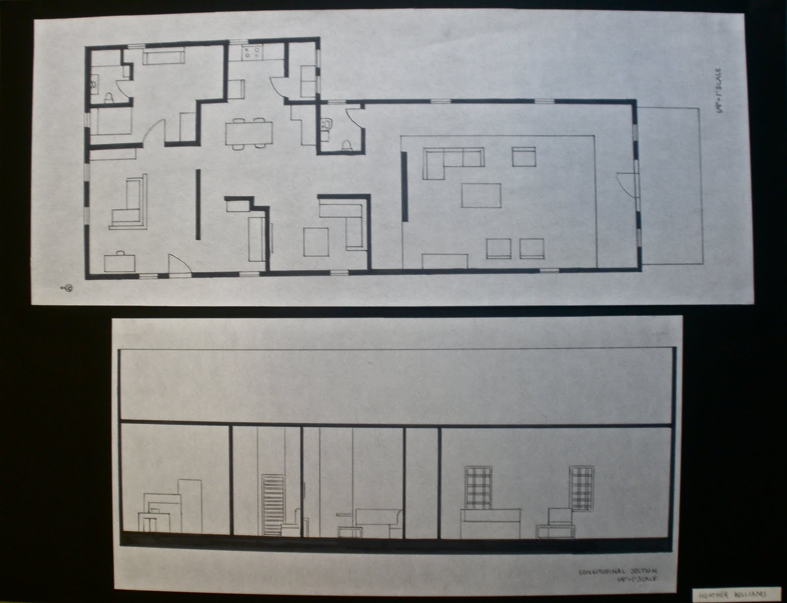
This project was to design a home and writing space where a writer could comfortably stay for a semester while writing. My initial idea for this was to create a space within a space to direct flow through the space so that it may be experienced in different ways, but without closing it off and making the space feel like it was chopped up and unconnected with the rest of the house. I created a floor plan that is mostly open. When you first walk in the space, there are no walls closing in the writing and reading area, but the floor of this space which is around the fire place is sunken in to divide the space as separate from the rest of the house. Also, the vertical wall directly at the end of the room goes al the way from floor to ceiling, but does not close off the space completely horizontally. The two sides are left open and you can walk around either side to get to a different area in the house. It makes it feel like one space, but vertical wall is a divider from the rest of the house to create its own space and prevent distractions from other areas. It is constructed of painted glass so that it is a barrier but it is not solid. It is somewhat translucent so the space is not closed off and light still comes through.

 Behind this is the dining area to the right side. The kitchen is placed along the wall that dips in to the outside windows and the dining is more toward the inside of the house but there are not walls directly separating the dining space from the kitchen space. To the left of the dining area is a sitting area that is enclosed on three sides by walls, but part of the side where the walkway is and the dining area is left open so that the space is not closed off and separated so that guests also feel that they can use this space and light will go into it. The only space that is completely closed off is the bedroom and the private bath that is only accessible through a door located in the writing room. In the back of the house is the writing room. It is located directly at a horizontal line going from the front door through the middle open  space in the house to the back. There is another vertical wall of painted glass at the beginning of this space where you enter that matches with the one in the front of the house. To enter the space, you have to walk around either side of the wall and you can see some of the space through the wall but it is translucent to block off distractions. I did this so that the writer would feel the connection that goes through the rest of the house, and also the windows and door in the writing room that lead to the outside so that they were not closed of. The space is open to allow light to come through from three different directions: The north and west wall from windows and doors, and from the south through the translucent wall and the space around it from the front of the house.  The space is set up into different sections so that the writer has different options and does not feel that they are enclosed in a box. One option is to sit on a couch that has a half wall made of the translucent material behind it that is facing a window and bookshelves, another option is at a desk, and there is another couch on the south wall that faces the translucent divider and also has a window to the left of them and light coming from the north shining through the divider. There is another bookshelf located next to couch. The couches are long and have places on the ends where you can lay our legs out and have an armrest go along the side.  There is wall lighting to create a soft lit area in the night and then floor lamps next to seating areas for extra lighting if needed. I think one of the most important part of the writing room is the door to the outside. The writer can go directly outside from the writing room and experience nature if they are looking for inspiration or just need a break from writing. I also like that it is located in the back of the house so nature is seen from all of the windows in the writing area. I did this because it is a Writer's Retreat so the most important part of the house is the writing area.  I took the idea of creating a space within a space to divide spaces but to still keep them open enough for light to flow through the building and create a sense that building is connected through this as one overall space. Then, i gradually towards the back allowed to spaces to become somewhat more private but still open to allow flow of light and a sense of more space in the most important space for this project, the writing area.

One point Perspective Renderings


Two perspective renderings of the studio

Material Rendering


Dining Project Spring 2011

The dining experience project was intended to create a space for people to gather and have a ritual dining experience while supporting world hunger, and bringing awareness to hunger in order to have a positive affect on those affected by it. 

I saw the most important focus of this project was around the idea of preventing hunger and less about designing something beautiful. Instead, I thought it was more about designing something less costly and more practical but at the same time making it a nice experience for the people attending. I thought it was important to keep the design cost efficient because in order to have an impact on world hunger and spread knowledge of it, there must be multiple locations where this event is held so that many different types of people could attend and also so that there would be a lot of awareness of the event and what it is about.

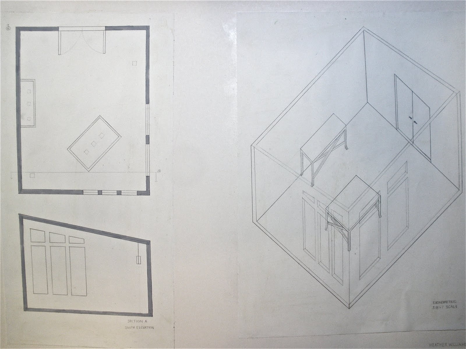
I chose Rio de Janeiro, Brazil as my location for the event because it is a larger city in South America where there is high crime, and a lot of poverty. When I have visited there in the past I have seen many children and families on the street searching for food. Because of its location, I chose bamboo as  the structural material for the space. It is prevalent in this area so it cost less to build and more money can go towards food costs and feeding a larger number of people. I chose large windows on the North and East side of the building because this is where the sun during the winter months where it is still warm, but not as hot will come through and in the summer it will not shine through as strong. 

I planned for these dining areas to be located directly along the street with other businesses so that anyone walking by can see that it is there and attend. This would act as a form of media because it would  tell people about the event and they would see exactly where it is.


The actual space where dining takes place is 18 by 20 to allow room for a large table for more people to attend and for circulation and extra space for a larger amount of people. That way it will not be too hot or  cramped. 


This is a model of my table and sideboard design. It is simple to go along with the design of the structure and also made of a bamboo wood